
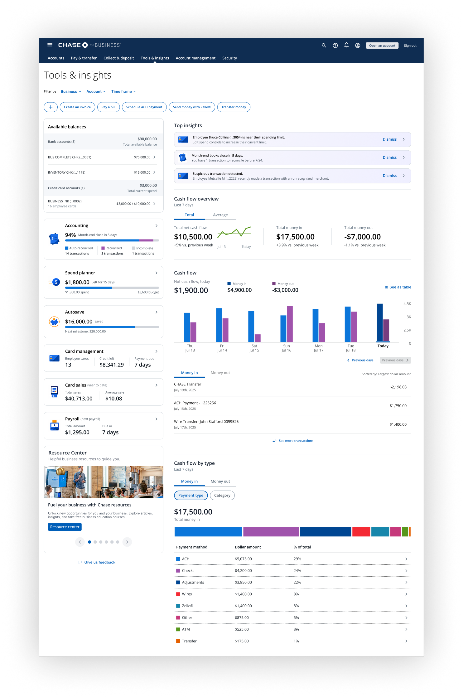
Tools & insights
Revisioning a stalled small-business banking dashboard into a multi-platform product used by millions of people.
Joined a stalling team that hadn’t shipped in three years. Reframed the strategy, rebuilt the design, earned executive sponsorship, and launched. Now driving the enhancement strategy and native mobile build.
Role
Lead UX Designer. Joined June 2025. Now manage two direct reports.
Impact
Over a million monthly active users. Steady week-over-week growth in return rate. Executive sponsorship from the CEO of Business Banking. Team headcount and funding expanded post-launch. 2027 expansion meaningfully expands the addressable user base.
Scope
Web dashboard (shipped, scaling). Native iOS and Android (in development, Q4 2026). Credit card, accounting, and expense management suite (in design, 2027 release).
THE PROBLEM
Three years of work. Nothing shipped.
The team had been working on this dashboard for three years and hadn’t shipped. The reasons weren’t mysterious.
The design was fragmented. Features looked like they’d been designed in isolation and pasted onto the page in whatever space was available. Information architecture had no underlying logic. Typography was inconsistent — an H1 in one section was an H2 somewhere else. The visual language was stuck in tile-mania on a gray background, which made everything feel heavy and dated.
The team couldn’t agree on design decisions, so progress moved in inches. There was no future vision — no shared sense of what the product would become in six months, let alone two years. Every conversation restarted from zero.
But the actual blocker was higher up. The CEO of Business Banking and his direct report weren’t convinced the design was good enough to release. Without their sign-off, nothing was going to ship — no matter how much engineering effort went in.
The work in front of me wasn’t a redesign. It was earning executive permission to launch.
THE PRODUCT
A financial home base for small business owners.
A cash flow dashboard for small business owners who bank with us. It pulls together their accounts, shows where money is coming in and going out, surfaces what they need to know about their business’s financial health, and routes them into the financial tasks they need to do next.
It lives inside the broader business banking experience and acts as the home base — the place a small business owner lands when they want to understand the state of their business and decide what to do about it.
ROLE & CONTEXT
Joined mid-flight, before launch.
I joined in June 2025 as the Lead UX Designer, replacing the two designers previously on the project. The team had been building for three years without a release. My mandate was straightforward: get this thing shippable, and earn executive sign-off to launch.
At the time, I was the only designer on the project. After the launch and the funding expansion that followed, I built out the design team and now manage two direct reports.
I work directly with PM and engineering leadership — leading strategy sessions, presenting milestones, and surfacing tradeoffs and process gaps to the broader team in real time.
Three years of non-shipment told me the team didn’t have an alignment problem in any one place — it had an alignment problem everywhere. Every conversation restarted from zero because no one had agreed on the layer above.
After aligning the team on strategy, I established three tactical milestones that aligned stakeholders, set delivery expectations, and made progress measurable to leadership.

STEP 1
Align on the house — vision
Problem we’re solving
Who it’s for
Why it matters
Got explicit, written agreement on what we were building and why. Ended the directional debates that had been eating the team for years.

STEP 2
Align on layout — strategy
Prioritized features
How pieces fit together
Sequenced by value vs. effort
Translated the vision into a concrete plan. The team stopped arguing about direction and started arguing about the right things — scope and sequence.

STEP 3
Align on the rooms — execution
Scope
Success criteria
Design sign-off
Locked individual features before delivery. Eliminated rework and the last-minute objections that had been killing velocity.
The framework worked because it forced disagreement to happen early and at the right altitude. Vision debates stayed at the vision stage. By the time we got to a feature, the only thing left to argue about was the feature itself.
THE STRATEGY REFRAME
Three years of research, sitting in folders nobody had read.
The team had three years of research, workshops, and user testing sitting in folders nobody had read in a year. I started there. I consolidated all of it, pulled the signal out, and rebuilt the product strategy into something the team and stakeholders could actually align on.
01
Vision
A clear, one-sentence statement of what the product is, who it serves, and how it earns its place in a small business owner’s day. Anchored to two strategic priorities: helping them track and manage their cash flow, and connecting them to growth-oriented products and services as their business matured.
02
Personas
Defined who we were designing for and — equally important — who we weren’t. The product was built for owner-operators and multi-account small business owners running real day-to-day operations. Not enterprise treasury managers, not personal-finance users, not casual browsers. Narrowing the audience sharpened every downstream decision.
03
Problems we solve
Translated user research into a prioritized list of specific, ownable problems. Top of the list: giving small business owners a clear, fast read on their financial health and the cash flow patterns that drive it. Below that: helping them act on what they see — surfacing the right tasks, the right products, and the right next steps without making them hunt for them.
04
How we win
Articulated the competitive position and the tradeoffs that came with it. The biggest tradeoff: we weren’t going to compete with fintechs on visual flash. We were going to compete on usefulness, trustworthiness, and integration with the broader banking experience. That tradeoff shaped every design decision that followed.
05
Success metrics
Defined what the business was accountable to: user engagement (monthly active use), return rate (do they come back), and cross-product adoption (does the dashboard surface relevant next products effectively). Numbers that mapped to both user value and business value.
The strategy doc itself wasn’t the deliverable. The alignment was. By the time we’d worked through it together, the team had a shared north star, and stakeholders had a document they could point to when scope or direction came into question. Both of those had been missing for three years.
THE DESIGN DECISIONS
Five decisions did most of the heavy lifting.
Strategy and alignment got us moving. These are the design decisions that earned executive sign-off and shaped what the dashboard became.
DECISION 1
One column doing two jobs.
Moved the secondary column from the right (where it read as an afterthought) to the left, and reframed it. It became the primary navigation into financial tasks and the surface where we deepened the customer's relationship with the bank — surfacing connected products, and beyond-banking services like payroll, insurance, and 401(k). One structural decision did two jobs: it made the product easier to navigate and turned the dashboard into a cross-sell engine.
DECISION 2
Two tiers, one mental model.
Each subsection was planned to have its own controls, which meant users were making the same selections repeatedly across the page. I split controls into two tiers: data-level controls (account, business, time frame) live at the top of the page and apply globally; section-level settings sit in context. Fewer clicks. Less cognitive load. One mental model instead of many.
DECISION 3
Negative isn’t bad. It’s information.
The original palette was Christmas — green for positive, red for negative, everywhere. I built a new system that meets WCAG AA accessibility standards, aligns with the brand, and stops shouting at the user every time a number went down. Negative isn't bad in a cash flow context — it's information.
DECISION 4
Better data, new capabilities.
Introduced new chart and visualization patterns to break down cash flow data in ways the old design couldn't support. This required pushing tech partners to invest in backend capabilities — multi-account aggregation and meaningful cash flow segmentation — that weren't on their roadmap. That negotiation became its own story (see Conflict & Judgment).
DECISION 5
Insights that mean something.
Most dashboards show data. Tools & insights interprets it. The insights layer flags anomalies automatically — an unusual transaction, an employee nearing their spend limit, a new credit offer — and routes the owner straight to the page where they can take action.
Nothing important goes unnoticed, and every insight ends in a next step, not a dead end.
None of these decisions were precious on their own. Together, they were the difference between ”not good enough to ship” and ”ready to launch.”
CONFLICT & JUDGMENT
Three fights worth having.
Pausing development momentarily.
The first real fight was convincing the team to halt active development to redo the design. Engineering was building. PM was tracking velocity. Stopping felt like going backwards. I argued the opposite — that if we kept going, we’d be rebuilding everything in six months anyway. Measure twice, cut once. Don’t take ten steps forward to take eight steps back. The team agreed. That decision is the reason we shipped.
Pushing tech partners.
The hardest sustained negotiation was with engineering leadership. The new design required backend capabilities that weren’t on their roadmap — multi-account aggregation and meaningful cash flow segmentation. Both required real investment. I made the case that without them, the product couldn’t deliver on the strategy we’d just aligned on, and the dashboard would ship as a prettier version of the same thing that hadn’t been getting executive approval. They agreed. Both capabilities are now live and are the foundation for everything we’ve built since.
Course-correcting on prioritization.
Mid-handoff on a few features, engineering came back with effort estimates significantly higher than we’d scoped. Rather than fight to preserve the original sequence, we pulled the feature, pulled the next-priority item from the roadmap, and kept moving. The roadmap held because the strategy held. When the foundation is right, you can swap the bricks.
OUTCOMES
Shipped, scaling, and earning room to grow.
In 2026…
On top of this success, user feedback has been consistently positive. The most common piece of constructive criticism is that users want more features on the experience — which is the kind of problem you want to have.
ACTIVE USERS
+389%
Customers that engage
MONTH-OVER-MONTH RETURN RATE
+86%
Steady weekly growth since launch
ORGANIZATIONAL MOMENTUM
Team and funding expanded post-launch.
EXECUTIVE SPONSORSHIP
Earned the executive sign-off three years of work hadn’t.
SCALING THE VISION
The dashboard earned permission to expand.
Native iOS and Android.
I led the design of the mobile experience from scratch with a separate engineering and product team. It’s not a port. The mobile app uses navigation patterns that don’t exist anywhere else in the bank’s app and makes meaningful use of the form factor instead of shrinking the desktop experience down. In development now, launching Q4 2026.
Credit card, accounting, and expense management.
Led the design of the next functional surface area for the dashboard — which extends it from a banking-customer experience to a credit-card-customer experience, and adds accounting and expense workflows on top. Releases in 2027 and meaningfully expands the addressable user base. It also creates a structural cross-sell mechanism: banking-only customers get surfaced relevant credit cards, credit-card-only customers get surfaced relevant business banking accounts.
The dashboard’s success earned the team permission to expand in two directions at once. The dashboard started as a single-platform tool for a narrow customer segment. It's becoming the financial home base for small business owners across the bank's product portfolio.
LEADERSHIP & MENTORSHIP
Purposely chose interns over senior designers.
When the team expanded, I was offered a choice: a seasoned designer or an intern. I took the intern. The project needed energy, range, and people who hadn’t yet learned to defer to "how things are done." Seasoned designers are great when the system is built. We were still building it.
I mentor my reports to work backwards from strategy — starting with finished designs delivered to engineering through complete specs, including edge cases, error states, and loading states. The goal isn’t to teach them how to design screens. It’s to teach them how to think in systems and how to deliver work that engineering can actually build without coming back with twenty questions.
Both reports are now shipping production work on the credit card / accounting / expense surface.
REFLECTION
The hardest part wasn’t the design.
What I'd do differently.
I’d push for the design halt earlier. I waited until I had enough credibility with the team to make the case stick — probably the right political call — but every week we spent building before the reset was a week we’d eventually have to rebuild. If I were doing it again, I’d burn some political capital sooner.
What I learned.
The hardest part of design leadership at this scale isn’t the design. It’s the alignment work that happens before any design exists — the vision conversations, the executive trust-building, the negotiation with engineering about what’s possible. The “house framework” came out of that realization. Most stalled projects I’ve seen aren’t stalled because the work is bad. They’re stalled because nobody’s done the alignment work at the altitude where the disagreement actually lives.
What's next.
Mobile launches Q4 2026. The credit card / accounting / expense expansion follows in 2027. Both will reshape what the dashboard is — and the case study will get updated as they ship.